Playing around
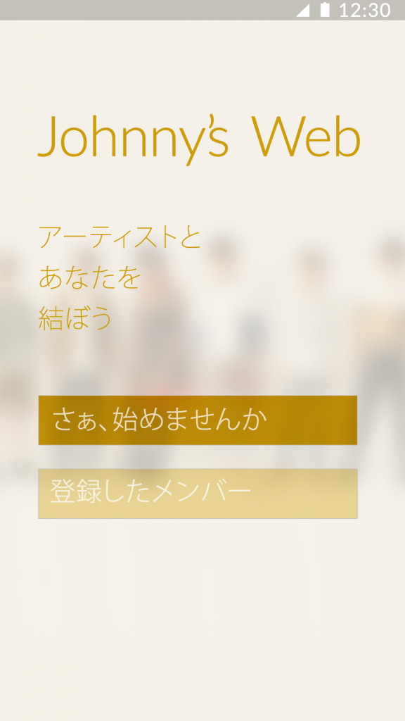
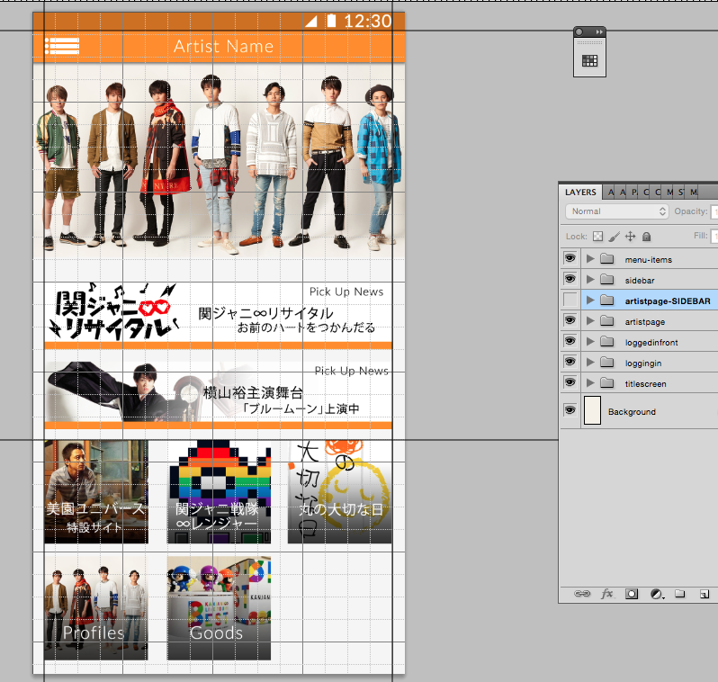
I’ve been playing around with mobile design. As more and more people go mobile, the design focus also goes mobile.

I love using Johnny’s Web and Net as test subjects. The site designs are so archaic that it seems like I’m jumping into a playground to see how I can bring it to the year 2015. The “app” is a pay for service that allows fans to read their favorite idol’s blogs… though it acts more like an authentication program since once your credentials are confirmed it launches a browser giving you access to a mobile website.

I can understand the reason why Johnny’s Web hasn’t taken the leap towards modern mobile design — majority of it’s users are still used to browsing the website via old ‘garakei’ cell phones. But considering people are paying almost close to 400 yen a month for this service, it deserves a nice design update or two.
I might decide to actually code it. It’ll be a fun experiment.